What Happened On October 21st?
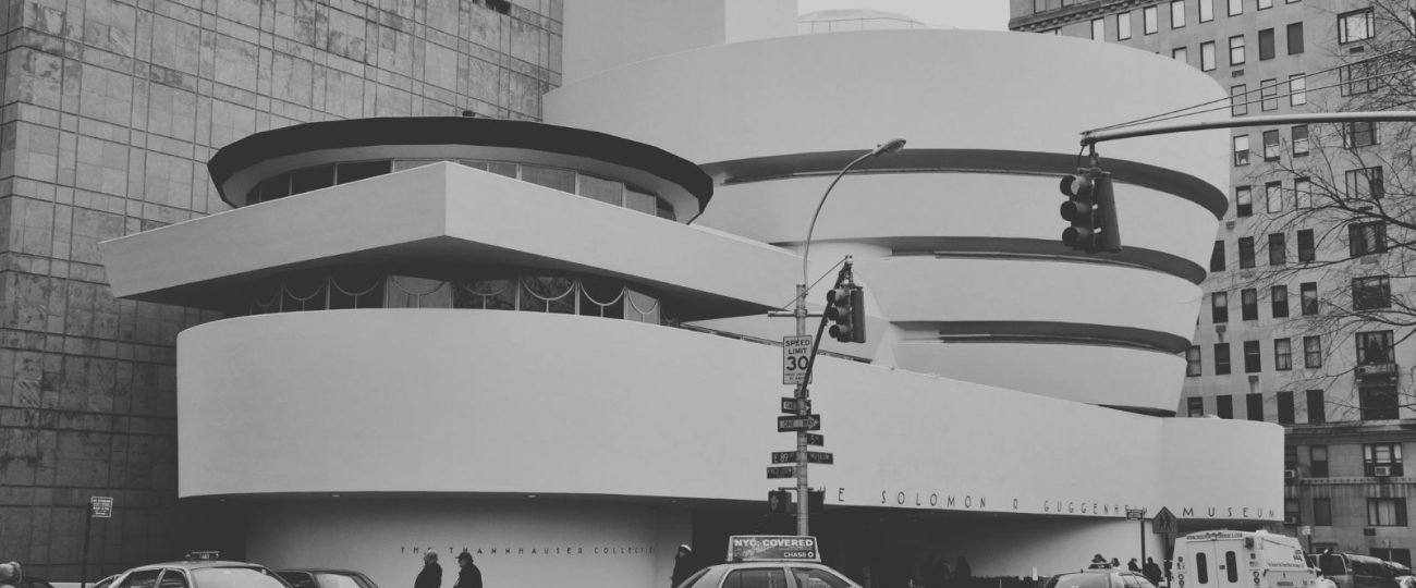
On October 21, 1959, crowds filled Fifth Avenue for the much-anticipated opening of the Solomon R. Guggenheim Museum in New York City. Frank Lloyd Wright’s white, spiraling building broke away from the traditional structures around it, standing out as a bold departure from the city’s usual architecture. Those who stepped inside discovered more than just a new venue for art—it was a space designed to completely change the way people engaged with it.
Inside, a sloping ramp wound continuously upwards around a central atrium, offering visitors an unbroken path through the museum. Wright rejected the traditional compartmentalized galleries, instead creating a fluid experience. The skylight above flooded the space with natural light, which changed as the day went on, making each visitor’s journey unique. Artworks on display by Kandinsky, Klee, and Picasso appeared differently depending on how the light hit them from different angles.
Solomon Guggenheim had built an impressive collection of modern art over the years, with Kandinsky’s abstract works forming a core part of the exhibit. Visitors didn’t just observe the pieces—they were immersed in them. The museum’s curved walls and flowing space created an interaction between the art and the building itself, allowing the works to be viewed from fresh angles that challenged conventional methods of display.
Critics, however, raised concerns about the museum’s unorthodox design. Many worried that the building itself would distract from the art within it, fearing that the structure’s boldness would outshine the artworks it housed. Some artists even resisted displaying their work inside, concerned that the sloped walls would change how their pieces were perceived. Wright remained confident in his vision. He intended for the museum to offer an experience that merged the building and the art, making them inseparable components of a larger whole.
The journey to opening day spanned more than a decade. Wright received the commission from Solomon Guggenheim in 1943, but the project was delayed by wartime shortages, financial constraints, and numerous obstacles in meeting New York’s stringent building codes. Wright refused to compromise his design despite pressures to simplify it. After 16 years of persistence, the Guggenheim opened, staying true to his vision of a building that challenged the conventional.
Wright based the Guggenheim’s design on natural forms, specifically the spiral shape of a seashell. He sought to create a space that moved organically, standing in contrast to the rigid lines and angles of the buildings that surrounded it. Wright believed the museum should feel like a living space, guiding visitors upward in a continuous, natural motion, allowing the art to be experienced as part of the journey.
Wright had originally envisioned the museum in a soft pink hue, believing the color would blend the building more gently with its surroundings. He argued that pink would soften the museum’s presence and better align with the organic shape of the structure. However, the museum’s trustees insisted on a white exterior, which they felt would provide a more striking contrast against the urban backdrop. Wright reluctantly agreed, though he always believed the pink would have given the building a more natural presence.
The construction of the Guggenheim involved overcoming numerous challenges. The building’s continuous, curved walls required custom molds and specialized techniques, making the process slow and complex. Engineers developed new methods to shape and pour the concrete in a way that matched Wright’s design. These challenges, combined with New York’s building regulations, resulted in further delays. But in the end, the building’s iconic spiral remained intact, representing a major feat in both design and construction.
Inside the museum, the art collection reflected the spirit of innovation present in the architecture. Alongside masterpieces by Picasso and Kandinsky, the museum displayed works by emerging artists whose pieces embraced experimentation and new ideas. Solomon Guggenheim’s support of avant-garde movements shone through the collection. Visitors walking along the ramp encountered art that pushed boundaries, much like the building itself.
Wright made a deliberate choice in designing the entrance to be understated. Unlike most grand museums, with large staircases or imposing facades, the Guggenheim offered a simple entryway that led directly into the atrium. Wright wanted the building’s interior to be the focus, pulling visitors in to immediately experience the space’s openness. The design ensured that guests would be drawn into the flow of the spiral, without the distraction of a dramatic exterior.
As visitors ascended the ramp, they encountered constantly shifting views of both the art and the building itself. Each step offered a different angle on the pieces displayed along the curved walls, while the architecture revealed new perspectives from every level. At the top of the spiral, guests could look down into the atrium and see how the building’s design connected everything into one cohesive experience.
Frank Lloyd Wright passed away six months before the museum opened, leaving the Guggenheim as one of his final projects. The building embodied his belief that architecture could achieve far more than practicality. For Wright, buildings represented living, breathing spaces that interacted with the people who occupied them. The Guggenheim, with its flowing curves and uninterrupted motion, demonstrated his philosophy to its fullest.


